Front-end developers often wrestle with responsive layouts—especially if they haven’t touched a certain technique in a while. Whether you’re a seasoned dev or a newcomer, you’ll likely google references on flex properties, grid tracks, or even “how to center a div in CSS.” Below, we’ll provide practical code snippets for both Flexbox and CSS Grid, plus tips to ensure your layout responds smoothly across devices.
1. Why Flexbox and Grid?
1.1 Evolution of Layout Techniques
In earlier times, devs relied heavily on floats, inline-block hacks, or table layouts for web design. But with Flexbox and Grid, modern CSS offers powerful, intuitive ways to:
- Align and distribute space in single or multi-dimensional layouts.
- Center elements (vertically or horizontally) with minimal code.
- Create complex, responsive grids without messy media queries.
1.2 Quick Comparison
- Flexbox: 1-dimensional (row or column). Best for aligning items along one axis, or building navbars, footers, or small content blocks.
- Grid: 2-dimensional (rows & columns). Perfect for full-page layouts or advanced, magazine-like structures.
Hint: Many devs combine both—using Grid for overarching structure, and Flexbox for smaller internal alignments.
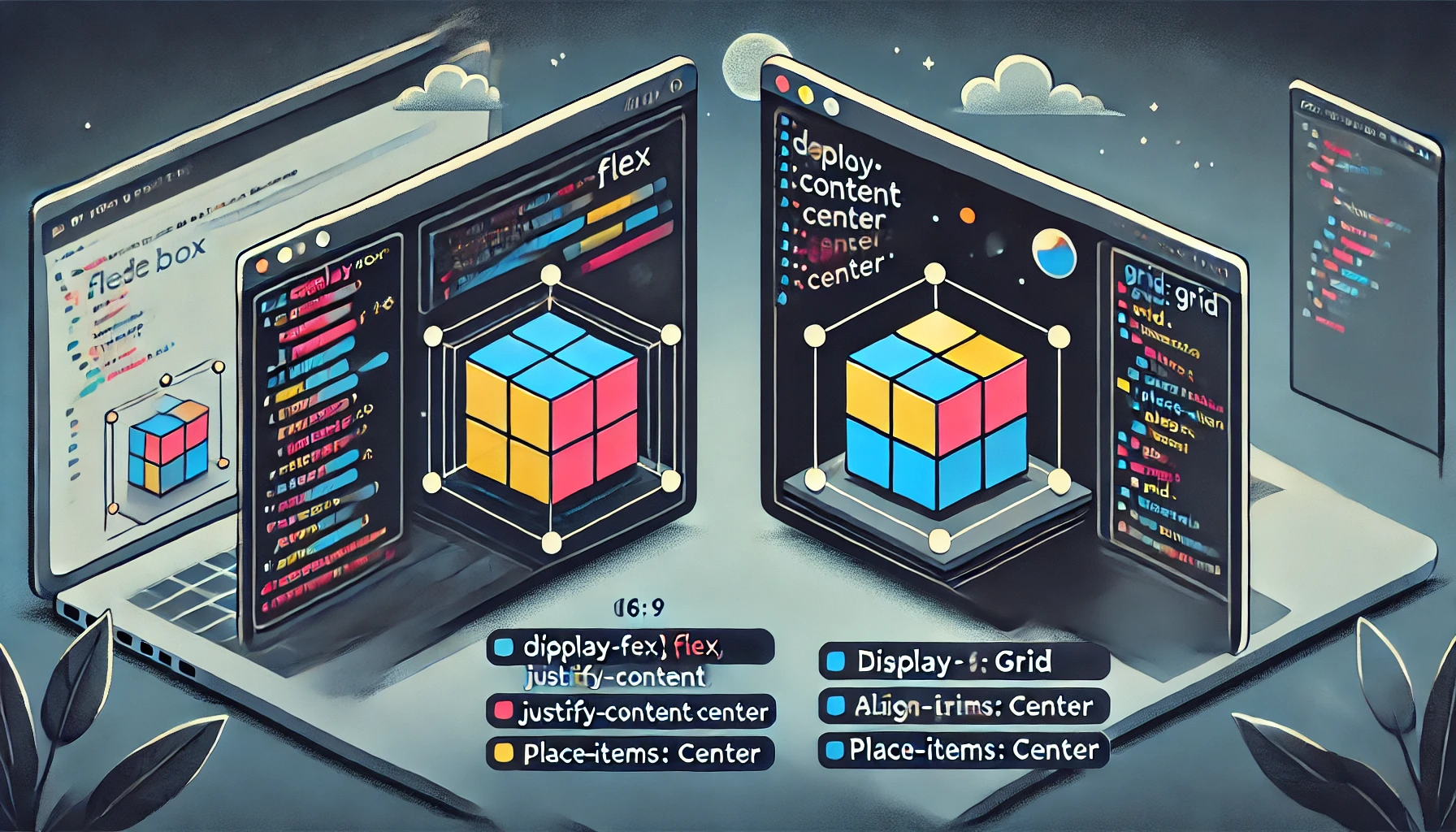
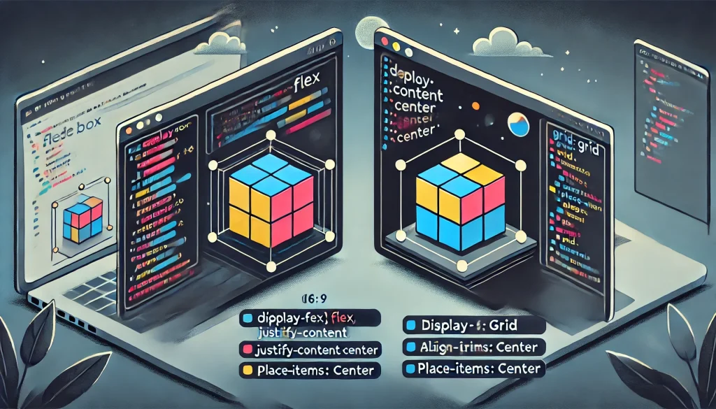
2. Centering a Div: The Eternal Question
Perhaps the most iconic layout challenge: “How do I center a div?” Let’s show quick solutions:
2.1 Using Flexbox
cssCopyEdit.container {
  display: flex;
  /* to center a child horizontally and vertically */
  justify-content: center;
  align-items: center;
  height: 100vh; /* for example, if you want full viewport height */
}
.child {
  width: 200px;
  height: 200px;
  background-color: lightblue;
}
Explanation:
justify-content: center;horizontally centers your.child.align-items: center;vertically centers it.- Some devs add
flex-direction: column;if needed, but for basic centering, row orientation suffices.
2.2 Using Grid
cssCopyEdit.container {
  display: grid;
  place-items: center; /* shorthand for: justify-items: center; align-items: center; */
  height: 100vh;
}
.child {
  width: 200px;
  height: 200px;
  background-color: lightcoral;
}
Outcome: In grid context, place-items: center; is the simplest way to center a single child (or multiple items) both ways. Like flex, the container’s height ensures vertical alignment.
3. Flexbox in Practice
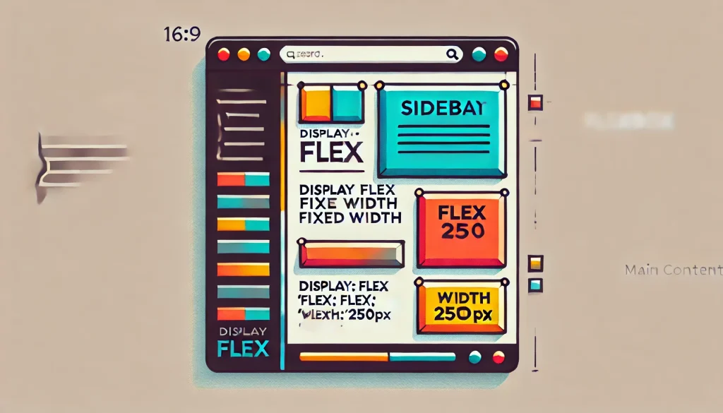
3.1 Basic 2-Column Layout
HTML:
htmlCopyEdit<div class="flex-container">
  <div class="sidebar">Sidebar content</div>
  <div class="main">Main content goes here</div>
</div>
CSS:
cssCopyEdit.flex-container {
  display: flex;
  /* optional: wrap if columns might stack on narrow screens */
  flex-wrap: wrap;
}

.sidebar {
  flex: 0 0 200px; /* fixed width */
  background-color: #f0f0f0;
}

.main {
  flex: 1;
  background-color: #ddd;
}
Key Points:
flex: 0 0 200px;forces.sidebarto stay at 200px wide if space allows.flex: 1;on.mainmeans it expands to fill leftover space.- Add
media queriesif you want.sidebarto drop below.mainon narrower screens.
3.2 Horizontal/Vertical Centering Trick
HTML:
htmlCopyEdit<div class="hero-container">
  <h1>Welcome to My Site</h1>
</div>
CSS:
cssCopyEdit.hero-container {
  display: flex;
  justify-content: center;
  align-items: center;
  min-height: 400px;
  background: linear-gradient(#4c9, #fff);
}
.hero-container h1 {
  color: #fff;
  font-size: 2rem;
}
Result: Headline is centered horizontally and vertically within that hero area, using minimal code.
4. CSS Grid Essentials
4.1 Setting Up a Basic Grid
HTML:
htmlCopyEdit<div class="grid-container">
  <div class="box box1">Box 1</div>
  <div class="box box2">Box 2</div>
  <div class="box box3">Box 3</div>
  <div class="box box4">Box 4</div>
</div>
CSS:
cssCopyEdit.grid-container {
  display: grid;
  grid-template-columns: 1fr 1fr; /* 2 columns of equal fraction width */
  grid-template-rows: auto auto; /* optional, can be auto or a set size */
  gap: 1rem;
}

.box {
  background-color: #fcf4dd;
  padding: 2rem;
  text-align: center;
}
How It Works:
- 2 columns, each
1frwide, ensures columns share the available space equally. gap: 1rem;adds space between boxes.
4.2 Advanced Grid Example: Areas & Named Lines
HTML:
htmlCopyEdit<div class="layout-grid">
  <header class="header">Header</header>
  <aside class="sidebar">Sidebar</aside>
  <main class="content">Content</main>
  <footer class="footer">Footer</footer>
</div>
CSS:
cssCopyEdit.layout-grid {
  display: grid;
  grid-template-areas:
    "header header"
    "sidebar content"
    "footer footer";
  grid-template-columns: 200px 1fr;
  grid-template-rows: auto 1fr auto;
  gap: 1rem;
}

.header {
  grid-area: header;
  background-color: #fafafa;
}
.sidebar {
  grid-area: sidebar;
  background-color: #eee;
}
.content {
  grid-area: content;
  background-color: #fff;
}
.footer {
  grid-area: footer;
  background-color: #ddd;
}
Result: A typical 2-column layout with a top header spanning both columns, plus a single footer row at the bottom. The .sidebar and .content share the middle row.
5. Responsive Strategies
- Media Queries: Tweak your
grid-template-columnsorflex-wrapat breakpoints. E.g.@media (max-width: 768px) {...}to re-stack columns or shift layouts. - Auto & minmax(): For Grid, minmax helps dynamically size columns. Example:
grid-template-columns: repeat(auto-fit, minmax(200px, 1fr));ensures each column is at least 200px wide or shares leftover space. - Flex Wrap: If you have a row of items in flex, enabling
flex-wrap: wrap;can let them reflow on narrower screens.
Goal: Provide a layout that gracefully adapts, without requiring separate HTML structures for mobile vs. desktop.
6. Best Practices for Layout
6.1 Start Simple
- Skeleton: Implement a basic grid or flex structure first—test it across multiple device sizes.
- Progressive Enhancement: Introduce advanced techniques (like grid areas, advanced alignment) once core responsiveness is stable.
6.2 Mind Performance
- Lightweight: Overly complicated CSS or nested containers might slow rendering or hamper maintainability.
- Avoid Overlapping: Resist heavy absolute positioning if simpler flex or grid solutions exist.
6.3 Accessibility
- Source Order: In some layouts, visually reordering items with grid/flex might shift reading order for screen readers. Keep semantic flow logical.
- Color Contrast: Ensure backgrounds, texts, or any overlay elements remain accessible, especially for users with visual impairments.
Conclusion
Flexbox and CSS Grid have transformed how devs build modern, responsive web layouts—center a div with just a few lines, create 2- or 3-column scaffolds, or orchestrate entire pages with named grid areas. By mixing straightforward patterns (for quick tasks like horizontal centering) with more advanced features (like flexible 2D grids), you’ll produce maintainable, elegant interfaces that adapt seamlessly to screens from mobile to big desktop. Coupled with the right responsiveness techniques and best practices, these layout methods make front-end dev in 2025 more powerful and direct than ever.
Key Tips:
- Use Flexbox for simpler, 1D alignments (navbars, item distribution, basic centering).
- Use Grid for multi-row, multi-column logic (full-page or complex card layouts).
- Combine media queries, fraction-based columns, or
wrapas needed to ensure smooth scaling.
Enjoy harnessing the modern approach to CSS layouts—empowering you to center everything from icons to multi-card sections, while guaranteeing responsive, aesthetic results.


